
web design blog | typography
The importance of typography in branding and logo design
Importance of brand typography
Pen Hunt, 15 January 2021.
Typography is no less important than the design that brings life to a logo and makes it eye-catching. The appropriate use of a typeface enables you to communicate with your viewers and gives them the right message for your business.It is not just about shape and colors; it has a profound message hidden behind it that can only be perceived with the proper selection of type styles for your identity design.
Have you ever observed the different typefaces of various leading companies and thought how beautifully they have used the text style, or what difference it would have made if the particular font would not have been used?
![]()
In a digital world, the awareness of identity design and text styles has increased among everyone. Now logo designers pay particular emphasis on identity design as they know what impact it has on the public's mind and that it is the only way people remember the product or company.
Importance of Typography in Branding and Logo Design
It is quite evident after seeing the unique designs and text styles used for the most popular companies how important it is to make the right selection of type and make it count.
Most people who have no connection to the design industry might wonder what difference the selection of a style of type could make or why it is essential to look for the right font? Let's answers these questions comprehensively with the following 6 guides for the successful branding of your business.
1. Successful branding
The brand is a distinctive personality of a business that creates an emotional and psychological relationship with people. If the company has a clear idea of what their identity is about, then it will be much easier for the logo designer to get their hand on the appropriate font-styles.
Every font depicts a unique message, so it can't be used for every brand. When it comes to business, the primary purpose of generating your typographic emblem is to attract maximum attention and recognition of your product. For this to occur you should choose a text style that is bold and eye-catching.
It will grab the public's attention and will force them to look at what their brand is about. Your graphic designer should implement that text-style in all designs that bring a sense of trust and harmony. If you use the red color in a logo for instance, it will show confidence about your brand and product as well as your place in the industry.
2. The appropriate font
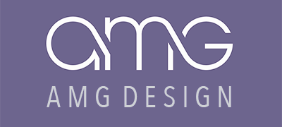
Using the right styles of text for the logo symbol is a bit more complicated however. Various graphic designers use the Avenir Next font for their work.
This font came into being a long time ago and is still being used by designers. It is a clean and legible sans-serif typeface, coming in many different weights and styles. The Avenir Next Condensed version is used in the AMG symbol.
This sans-serif type style is not only limited to logos, but has also been used in headings and text to enhance the readability. Therefore before selecting a font, make sure that the selected typeface reflects your image and is in harmony with your company image.
Experiment with different typography first and then make a final selection. And with time, you will be able to make the right selection.
Good logo designers know about the readability factor in logo design
The readability of your chosen typeface is a crucial factor that should never be neglected. If your customers or viewers find it hard to read the text of your logo, it will have an adverse impact, and will create a bad image of your brand. They will be more likely to visit someone else’s brand where the font chosen is clear and legible.
It is the rule of Typography that the context should be readable and understandable so that people can acknowledge your brand and products readily. Before finalizing, make sure that it is readable on every possible screen size or device from which people might see it because it will appear differently on different devices.
4. Logo Voice
When great typography is used in the structure of a trademark, it adds another dimension to the brand. It gives bearing to the voice and the message of the company and fundamentally impacts the public, initiating the right emotion and feeling from both the owner and the viewers.
On the off chance that it can't convey the right message to people in general, all your hard work will be in vain. This is the reason that it is best if the designer finds out about the various ways a choice in typography can help improve the logo design structure. Best professional graphic and logo designers keep an eye on all these essential things to avoid any future issues.
5. A less complicated font
Whenever you select a typeface for your trademark, don't make it difficult and complicated for yourself and the viewer. The primary purpose of the font is to enhance the readability, but if a person fails to understand the context, it won't give a boost to your business.
![]()
Moreover, printing a complicated logotype or symbol is another challenging task, and during printing it might not give you a satisfactory result. Hence, avoid using challenging and complex fonts in your symbols, including Comic Sans and Papyrus.
You might have noticed the striking emblems of various leading brands, like The London Underground (above), Nike, Apple, Google and Fedex (to name a few) that demonstrate the use of bold, minimal, sans serif fonts, which enhance the brand recognition and type legibility.
6. Logo design with instant appeal
If you create your symbol according to the Typography rules, it will get instant attention from the public that will surely boost your brand name. ![]()
When your emblem appeals to your customers, it creates the right image about you and your products and they are more likely to visit again and again with repeat orders.
The Fedex identity symbol above shows how the use of a bold, clean sans-serif font along with the use of white negative space for the clever arrow creates a simple and memorable impression.
It allows you to be one step ahead of your competitors and lets you grow in the market. If you have planned to use 2 fonts instead of one, make sure they are in harmony and compliment each other.
The compatibility of the fonts is the main factor, so don't take it for granted. If you have chosen a serif-style, be careful in choosing a second font for your symbol.
When you keep all these factors in mind, nothing can stop your company identity from being successful.